Wednesday, April 27, 2016

Tambourine Dreams


When I first joined a group of some friends playing music a few years ago, I bought a new tambourine that I couldn't wait to paint -- an idea very much fueled by the inspiration of favorite art heroes, The Fool: a Dutch design collective who got their start in the late 1960s (a good article about them contemporary to their heyday found here, and I've also pinned some favorite images along the way for even more visual reference). Their colorful vision extended into every aspect of life: from album covers, clothing designs, painted furniture, murals and more, exemplifying that art is truly a way of living. They even recorded an album of their own, which I am happy to have in my collection! 

Late last year I was excited to receive a private commission of another tambourine: 


Happily it arrived safe & sound across the Atlantic to London, to the home of a lovely lady with a golden voice! I painted it with several layers of fluorescent acrylic, shiny metallic gold (difficult to entirely capture in the photo), and a few rings of glow-in-the-dark paint around the top. 

On-stage glow! Photo via Ellie
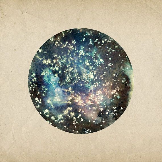
The Magnetic Mind

While the process was definitely different from my favorite medium of watercolor/ink on paper, I loved doing these projects. Combining two great passions of art and music is always a perfect match! 

Wednesday, April 13, 2016

⇋☼⇌ Recent Work ⇋☼⇌


Working on this colorful illustration for Michelle at The Sacred Expanse was so much fun and turned out to be one of my favorite commissioned projects! She had a specific celestial image concept in mind to reflect her offerings: workshops and events focused on intuitive, spiritual well-being and harmony in the everyday. We incorporated balanced imagery of the sun and moon with silver and gold acrylic paint surrounded by watercolor, arced with a vibrant rainbow and an overall geometric vision of symmetry. 
⇋☼⇌


It's always an honor and privilege to be trusted in helping someone's business come alive in image-form, and while the nature of my work doesn't usually lend itself to logos, when my friend Suzy spoke with me about what she had in mind for her business ILLUME (professional organizing services with a focus on Feng Shui), I was more than happy to be a part! From start to finish, this design was hand-drawn and painted, with a black and white design chosen to represent the main logo as it is flexible and graphically bold. For the full-color image, an ink circle still surrounds the watercolor butterfly, kept simple with black, white, and a warm turmeric yellow. 
⇋☼⇌


Image via Craft Not Crap

When Nick contacted me about collaborating with him on the label for his latest beer, Spirit Braid, part of the Brewer & Artist Series at Hardywood Park Craft Brewery, I jumped at the chance! I had been wanting to work on a project like this for a long time and was so excited for the opportunity - and I love this brewery! Such a supportive group of people for all things Richmond. As a Lead Brewer at Hardywood, Nick has an affinity for saisons: this would be an effervescent farmhouse-inspired ale brewed with a hearty blend of yeasts, raw organic wheat and oranges, light and perfect for the warmer Virginia spring days. He wanted something simple and lettering-focused, with a small braid and feathers as an accent illustration to complement. To capture the bright elements of the beer, I painted the Spirit Braid lettering in a pinkish-red watercolor with bursts of yellow orange to represent the pops of citrus.
⇋☼⇌

Definitely click through the links to visit the websites for more info on all!  


Wednesday, September 9, 2015

Tompkins Square Label 10th Anniversary


What a cool experience it was to create this poster for the 10th Anniversary celebration of Tompkins Square Record Label in NYC. This show has such a dream line-up of musicians, and now that it's one month away it's finally almost here!


The first time I came across Peter Walker's beautiful 1968 album "Second Poem to Karmela..." some years ago in the basement of Plan 9 Records, I remember pulling it for a listen based purely on the appeal of its lovely cover art of swirling hand-drawn illustrations around a black & white photo filtered in pink. All too often this particular "pretty cover, must listen!" judgement call doesn't work out as well as hoped, but this record quickly became one of my favorite and most listened-to finds during those days, and I would never have imagined a time that I would be carefully painting his name out in watercolor for an actual event in 2015!

The case is the same with Michael Chapman, who I had the great pleasure to see when he came through town a few years ago and played two mesmerizing sets that conjured up magic both dark and beautiful with his particular style on guitar. And as a note to those also in the Richmond area, I hear he will be coming back through town again to play on October 7th at Black Iris - mark your calendars!

So the ethereal, transporting sounds of Peter Walker's "Second Poem" and his earlier "Rainy Day Raga" from 1966, Michael Chapman's fantastic "Rainmaker" (1969), and Ryley Walker's latest album "Primrose Green" remained steadily on repeat during the process, with the hopes that some of the spirit within their music would be injected into the artwork.

Please come if you will be in New York on October 9th, it's sure to be a special and once-in-a-lifetime event!! Truly perfect sounds for the changing season and another Autumn on the way.


Tickets / Event Info

~ ~ ~


 Tompkins Square 10th Anniversary Mix on Spotify


Monday, May 5, 2014

Fresh Season


After what was perhaps the longest, coldest winter I can recall, spring has now been in full bloom officially for enough time now that I feel safe to say it's truly here - soon to be summer before we know it! For now, I'm truly appreciating the lush greenness of this picturesque commonwealth state and these days of breezy sunshine and budding sprouts. Though there's always more work to be done that requires sitting at a desk indoors, it's difficult not to want to spend every free moment with the sun, soaking in the low-humidity and fresh air. Spring looks good in Virginia: trees dressed in pale pink & white blossoms wear them well among old houses; even the gravestones lighten up.

My parents have been here for a few days visiting from Texas, and yesterday we took a short scenic drive out of town to visit an old plantation house and peek at more marked historical locations of the civil war as they dot the countryside, ghosts of the nineteenth century blowing gently through meadows...


~~~~~~~~~~~~~~~~~

In art-related news: working on several things that can't be shared as of yet, but just a couple months ago I noticed that this old interview from the Quirk Gallery show last summer was posted after their new website went live, and so figured I'd share... a nice throwback to last year when things were busy in the best way!


Thursday, October 10, 2013

Interview in REVIVE #1


Apologies for the poor quality of these screen shots I took, but just wanted to share a short interview I did for the first issue of REVIVE Vintage Magazine, put together by the Pavo Collective - a group which includes lovely friend and prior collaborator Lise Silva. What a cool honor to be featured in it, along with her most recent beautiful art fantasy photo series (pictured on the cover)!  


↞◈✿◈↠  ↞◈✿◈↠  ↞◈✿◈↠

Thursday, August 1, 2013

Dream Threads: Shop Show at Quirk Gallery


I briefly mentioned this show in my last post, but with the reception this evening, I thought it would be a good time to share a bit more about it here today! 

I'd been working on these paintings nonstop since returning from California, and it's so exciting to see them finally all neatly installed upon a freshly painted white gallery wall! My theme for this show was a collection of colorful watercolor paintings that could be hypothetical textiles, or that held a common or repeated geometric pattern which could be part of one. Patterns that are timeless - they could be worn, lived with, meditated on, enjoyed - and bright, vibrant colors that would fit right in with the summer sun. 
Pieces created with a principal intention of celebrating beauty and with a simple purpose of making viewers feel good. 

Quirk Gallery was nice enough to do a Q&A blog post on their featured work this month, which hasn't been posted yet, but I'll be sure to share the link when it does. And in the event that you happen to be in the Richmond area, the shows are up through the end of August!

✲ ✲ 


Wednesday, July 17, 2013

All Around


First Day of Creation - from the 1493 Nuremberg Chronicle


                                          ○○ 

Something about circles has been so appealing lately, to the point where I included two new paintings of them in my own show that just opened at Quirk Gallery (more on this soon!). I may have to do a bit of meditating on what could be the personal current significance with this particular geometric connection, but for now I wanted to share some artwork by others (from a variety of eras, and that I haven't already posted about before) that focus on a prominent roundness. They are everywhere!


Julio Le Parc

Emil Bisttram

Anne Nowak

Alexander Rodchenko

Naum Gabo

Michelle Tavares

Lena Wolff


Erika Giovanna Klien